Dear Starbucks,
No bullshit this time. It’s time to talk about your new cups.
I’m not one of those Starbucks enthusiasts who sit patiently outside their local coffee shop on November 1st, anxiously awaiting the latest pre-holiday design on these cardboard cylindrical drink holders. I had no qualms about the minimalistic red cups you put out last year – in fact, I appreciated them for how much easier it was for my barista to write my name on them – and have had no issues with your cup designs in the past.
But this one…we gotta talk about it.
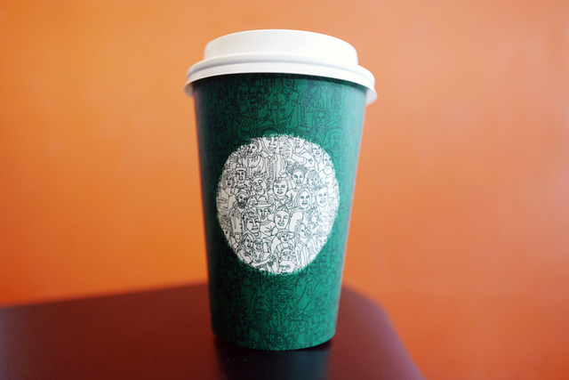
First off, the faces on these cups are terrifying. Actually the stuff my nightmares are made of. Half of them don’t even have necks, which is just rude. Everyone’s features just look proportionately off. And what the heck is up with that one guy in the white circle whose abnormally large hand is holding up another coffee cup to another guy’s ear?

Secondly, why, out of all the colors available to you, did you pick green as the predominant color on the cup? Your logo is already white and green; how lazy were you feeling that you thought just using those same two colors would make these “limited edition” cups seem more exclusive? In my opinion, it just seems really lazy. I’m not even saying that the cups should’ve been red or any other festive color. Personally, I’ve always wanted to drink my Americano from a purple and gold striped coffee cup, but that’s just me.

And lastly, why are you heartless? This design was apparently drawn by an artist in “one continuous stroke.” Why would you make anyone do that? That sounds excruciatingly painful and unnecessary. How badly was this artist’s hand cramping after being forced to do this? And while I guess it is impressive that someone sat down for x-hours to draw this…was it absolutely necessary? Someone probably could’ve drawn a better similar design for less labor and made the people in the design’s faces at least look less terrifying.

There’s a rumor that these are just placeholders for the actual cups to be released later in the year, and I sincerely hope that’s true.
Sincerely,
“Sad and Salty about Starbucks”